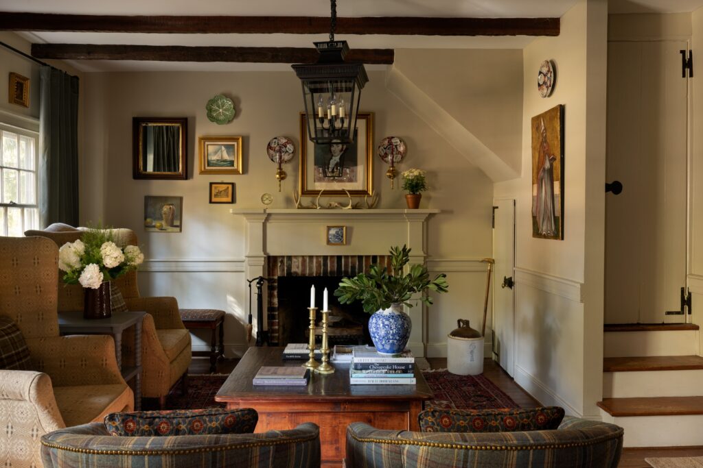
Last December, for the first time, the Pantone Color Institute chose a white shade as its color of the year. But since Cloud Dancer was awarded the designation, there has been a warming trend in interiors. Designers have been moving away from cool neutrals, hard and shiny surfaces, and other hallmarks of minimalism. Maximalism, with its saturated hues, has been running rampant. So have floral fabrics and quirky, personalized spaces.
But steering away from sterility doesn’t need to mean embracing Day-Glo color schemes with school bus yellow walls. Warmth is most commonly associated with “warm” colors (reds, oranges and yellows) and a toasty temperature. The concept can also be interpreted more broadly and subtly, referring to comfort. Color, light, texture, patina and form are all ways to raise a home’s figurative temperature — just in time for the colder months.
Color
Like the flashing lights on a traffic signal, fiery hues often overstimulate. Mixing in blue (or white or black) can make them more nuanced and livable. Take Benjamin Moore’s Webster Green, the company’s 2027 color of the year. The midtone blue-green achieves a balance between cool blue and warm yellow. For its 2027 Color Trends palette, Benjamin Moore also chose Wild Aster, a light grayish pink (a red modulated with white and black) and several browns, including Antique Copper.
“Colors that are muddier feel more timeless, adding earth and a warmth of living to it,” says Molly Kunselman of Molly Kunselman Design.
To make a space feel more enveloping, try color drenching: Paint the walls, trim and ceiling the same or similar colors. Andrea Magno, a Benjamin Moore vice president whose portfolio includes color, suggests choosing a few tones or shades from the same paint chip or color card, using the lightest one on the ceiling.
Magno also recommends evaluating how the natural light in a space affects the way colors appear. “Natural light can make a saturated color like yellow feel like it is glowing, which is not what people are looking for,” she says. Muted yellows like butter yellows are generally more versatile.
Paint with a less-glossy finish can also feel warmer, Magno says, as light reflects more off paint with a higher-gloss finish, which can result in a cooler effect. “If you want to wrap yourself in a cozy blanket [feel], use a lower sheen and a matte or eggshell finish for more of that cozy vibe,” she says.
Light
Light imparts literal and psychological warmth. A light fixture’s spec sheet or packaging should specify its rating on the Correlated Color Temperature (CCT) index. Light with a CCT rating of 2700 Kelvins or lower has a yellowish tint and reads as warmer psychologically, says Kevin Houser, an engineering professor at Oregon State University and the co-founder of the lighting company Lyralux. Light with a rating of 5000 Kelvins or higher emits bluer light and appears cooler.
The Color Rendering Index (CRI) measures how the spectrum of light generated by a light source reveals colors in objects. “All electric light sources to a certain degree distort the color of objects,” Houser says, but the right color rendering can make colors appear vibrant, rather than dull. In general, he suggests a CRI rating of 90 to 100.
When it comes to the number and placement of lights, compose an environment that is intentionally nonuniform, with three layers of lighting. “An ambient or low layer of light banishes darkness,” Houser says. “Layered on top is sparkle, an element that creates more animation. Then a candle or chandelier to create visual interest, which is the third layer. Focal glow directs eye movement. You could highlight a painting on the wall so there’s higher contrast with the surrounding wall.”
To control these three layers independently, use dim-to-warm LED bulbs. “LEDs endeavor to mimic the spectrum of incandescent or halogens,” Houser says. “They’re almost nostalgic.” At full output, their CCT is higher, for a cooler feel. As they dim, their light feels warmer.
Texture
“Fabric is the bridge between us and a structure,” says Kunselman, who likes to use grass cloth wall coverings. “We use it for literal comfort and warmth, and when it dresses a room, it makes that connection to humans. A throw on the back of a sofa or chair is psychological warmth.”
Even hard materials like tile can read as softer and more comfortable when their surfaces are uneven. “Warmth comes from more than color. It’s the feeling of being invited to settle in,” says interior designer Adrian Galvan of Designology.
Patina
New builds can feel cold and impersonal. Like old-growth trees, well-preserved structures comfort and reassure. In the spaces she designs, Kunselman incorporates older elements.
“There is something about looking backward and remembering bygone eras that gives a good feeling,” she says. “Vintage items have a feeling of imperfection. When something is older, it usually has a bit of patina. Patina draws us to it, the wisdom it carries. In pine, you can see the knots. They tell a story, ‘Oh, this is pine and who knows where this tree may have been.’”
And some clutter can be a positive — specifically, decorative objects “that feel personal and collected rather than overly matched,” she adds.
Layout and form
Smaller spaces are a good thing when it comes to warmth. Consider breaking up large expanses with screens, alcoves, dining nooks or seating areas to lend coziness. Research has also suggested that rounded shapes in interiors are comforting.
“We know that psychologically, a rounded table puts us at ease,” Kunselman says. “Rounded corners give us this sense of being hugged in a space that is enveloping you.” And nothing’s warmer than a hug.
The post In home design, cold is out and warm is in. Here’s how to raise the temp. appeared first on Washington Post.