Paul Shaw is sick of Helvetica.
The claim that it’s the most legible typeface is “totally untrue,” the New York-based design and type historian said. “We’ve got 50 years of improved fonts.”
All that to say: Shaw wasn’t thrilled to see that the D.C. Metro’s new signs are still in Helvetica.
His particular frustration is just one of many that people have been expressing about the new signage Metro has started to unveil. Some riders are upset that the signs are changing at all.
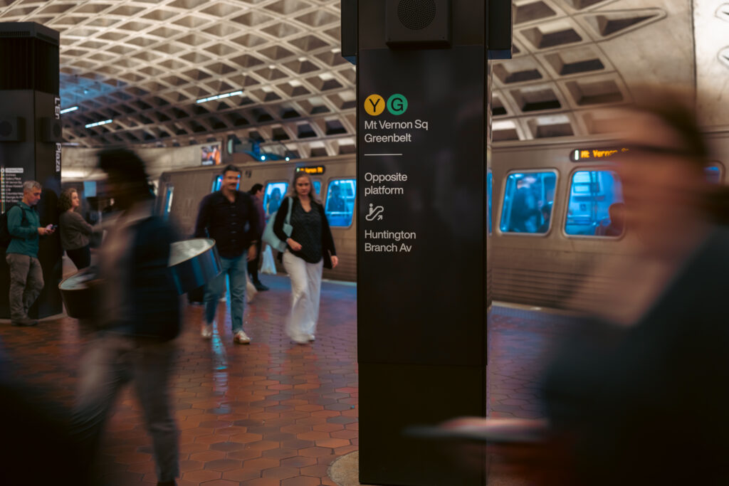
Earlier this month, the Washington Metropolitan Area Transit Authority began installing new wayfinding signs at the L’Enfant Plaza station. Metro said it expects to spend the next five years updating the signs at all of its rail stations.
Metro introduced the change by describing it on X as “more unified, and user-friendly signage across the system.” The post featured a photo of a trackside sign that no longer notes the direction each Metro train was heading.
Shawn G. Chittle, who works at the U.S. Office of Personnel Management, replied to the post: “Rethink this before you scale it out. It’s not well done, unfortunately.”
The changes are intended to make it more convenient for passengers to navigate the system, including by more easily finding the correct rail line, platform and exit, according to chief customer officer Sarah Meyer. A 2023 Metro survey showed that 3 in 5 customers believe Metro needs to do more to help customers find their way, with 2 in 5 saying they had taken the wrong exit at least once.
In the next six months, Meyer said new signs will be installed at five other stations, including Farragut North and Farragut West. The entire project is approved in the capital budget for $37.8 million over the next six years, according to a Metro spokesperson.
“I’m excited about the system that we have come up with to alleviate some of those common pain points,” Meyer said.
But online, the reaction has shown not everyone is excited.
“Not as bad as the horrific website, but close,” freelance journalist Amanda Moore wrote on X.
A Reddit user wrote: “I have resting nice face and this is going to cause zillions more people to ask me for directions.”
Some social media users took particular issue with the trackside signs no longer indicating which direction the train goes. The new L’Enfant Plaza signage “provides no meaningful wayfinding,” one person wrote on X, adding, “this makes *NO SENSE*.”
Meyer said she wasn’t surprised by the backlash. “When you see the picture on social media, I understand the reaction,” she said during a recent afternoon walk around L’Enfant Plaza station. “But when you see it as part of a system, it starts making more sense.”
The destination information that was on the trackside walls is available on updated “station ahead maps.” It’s also still available on the displays that say how far away trains are, and digital screens in the middle of platforms will be installed at more stations, Metro said.
“It’s not gone,” Meyer said. “It’s just moved off of the trackside to other places where it’s more helpful.”
Thom De Boo, a transit YouTuber based in Washington, also dislikes the trackside sign change, even though those destination details are available elsewhere. “I just think that’s too much of an omission of information,” he said in an interview.
Still, De Boo said he liked the new labels for exits, which are marked by capital letters. “Once you figure out which letter you need to go to, then it’s easier to follow signs, because they’re bigger and a little bit more universal,” he said.
Some social media critics focused more on the aesthetics of the new signs, rather than their functionality.
“Not only are they not useful, they’re actively ugly. The kerning is an abomination,” one Reddit user wrote about the signage. Another Reddit user wrote: “ughhh the kerning! my eyes can only take so much.” Kerning refers to the spacing between individual letters.
The font for the new signs was slightly changed to Helvetica Now because “it’s more modern,” according to Dan Klingessrow, a graphic designer at Metro.
“We didn’t want to restore it exactly as it is because it’s not 1976 anymore. But we definitely wanted to bring that thread through. So our goal was timeless design but modern usability,” he said about the broader redesign. “It’s an incredible legacy that we have, but we also didn’t want to be hemmed in by it.”
Unlike New York’s subway system, which was assembled from existing rail lines and later developed an identity when it was amalgamated under the control of one system, D.C.’s Metro was intentionally designed from the start, according to Alex Bitterman, an architecture and design professor at SUNY Alfred State College.
“The Metro proved that public infrastructure can be beautiful, and that beauty is a public good,” Bitterman said.
The Italian designer Massimo Vignelli is behind the D.C. Metro’s original wayfinding signage. It’s no small feat that his designs have become iconic 50 years later, said Bitterman, who has studied public transit branding.
“The signage that Massimo Vignelli designed was there really only to quietly whisper to people where they should be going. That combination between graphic design and architecture is very, very, very rare,” Bitterman said.
Each Metro station is a product of its time, which means signage across the system is inconsistent, according to Meyer. The new signs will create a unified system, she said. There are also errors to be addressed, she added, like North Bethesda station sometimes still being called White Flint on signs.
Metro will also remove the colored stripes from the pylons, which indicate the lines serving a particular station, in favor of colored discs with letters.
“We evaluated if that information was helpful or not, and if it was accessible or not. It failed both of those criteria,” Meyer said about the pylons. “The discs are able to be interpreted and seen by those with vision difficulties, and more people understood what the symbols were.”
De Boo said he opposed the pylon change because he thinks they’re an iconic element of the Metro.
“Those are part of the D.C. streetscape, and changing them isn’t going to look nice,” he said about the pylons. De Boo said accessibility should be prioritized over aesthetic, but in this case, he thinks the stripes could remain while also adding the new discs.
Part of the reason for the backlash is that people have a very personal relationship with design and transit, Klingessrow said.
“If you’re a daily rider, you just latch on to your hyper-personalized experience of it,” he said. “So when we change something, people have a big reaction.”
The post Metro is changing its signage. Some riders aren’t happy. appeared first on Washington Post.