Remember how things looked in 2016?
Direct-to-consumer brands like Warby Parker and Everlane introduced themselves in tidy, sans-serif typefaces. Pastels, especially millennial pink, surged onto Instagram feeds and Glossier mascara tubes. A “self-aware, stylized blandness” called normcore inspired art kids to reach for the drabbest of khakis. The overall effect was sterile but soothing, as if to suggest our lives might somehow absorb the cheerful legibility of a Casper mattress ad.
Fast-forward a decade, and this muted visual language — which came to be known as millennial blanding — has receded. Something misshapen and unruly is rising in its place.
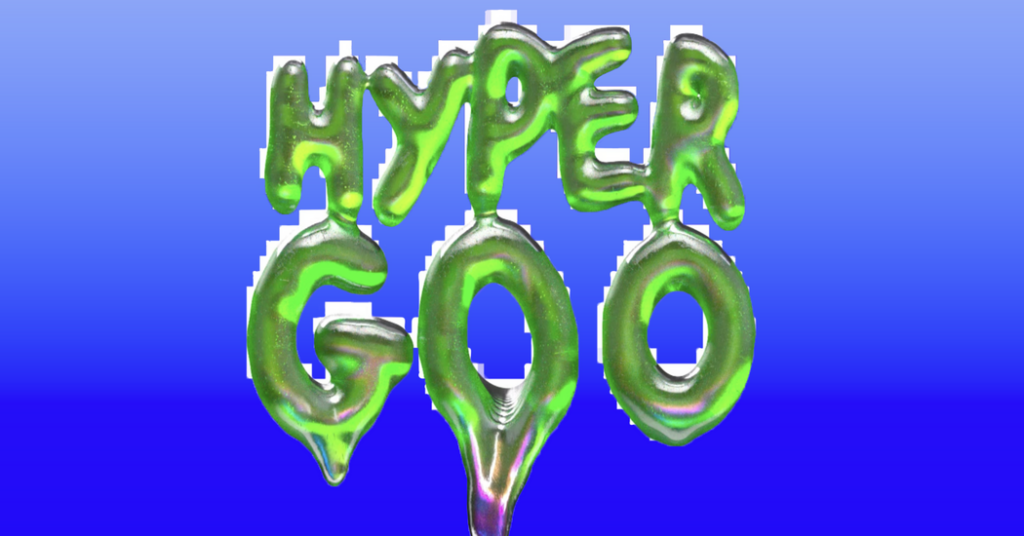
Let’s call it hyper goo: a style of glitchy, gloppy maximalism that has landed on consumer culture like a wet sneeze. Text on shampoo bottles and pickle jars increasingly resembles the inner workings of a lava lamp. Negative space has grown cluttered with doodles that look as if they might have been made in Microsoft Paint.
The look involves an uncanny mash-up of surreal smoothness and digital degradation, with the saturation cranked up high enough to startle Lisa Frank. The pastels that were ubiquitous a decade ago aimed to reassure an earlier generation that they could use their limited spending power to optimize their lives. Hyper goo does the opposite, reflecting back to Gen Z the distortion of the world in which they are coming of age.
You see it everywhere that advertisers are jockeying for young eyeballs. In grocery stores, Soylent-bottle minimalism is making way for hot pink snack bars with bulbous typography. At vape shops, slim Juuls have been usurped by nicotine-delivery devices that look like radioactive gumdrops with Tamagotchi-style screens.
Apple ads are suddenly hospitable to plump letterforms and an impish blue monster mascot. Anyone driving through the California desert on the way to Coachella would have passed a billboard for the Gen Z girl group Katseye that seemed to have been made with leftover Nickelodeon slime.
Viewers have grown suspicious of anything that looks too polished, said Gael Aitor, the creative director of Grownkid, a social club for 18- to 24-year-olds. His event invitations are pixelated in the manner of his favorite childhood computer games, and often feature a “nasty” shade of green.
Even the White House is sending out chaotic, lo-fi memes, he pointed out.
The clean look that once signified sophistication now reeks of venture capital funding, or worse, artificial intelligence.
“The worse it looks, the better it performs,” he said.
After ‘Sweetgreenification’
It is not just that the visual hallmarks of the direct-to-consumer boom have grown stale. Its standard-bearers are being toppled by cultural headwinds: Last month, Everlane, once synonymous with sustainability, was acquired by the fast-fashion giant Shein. Allbirds has pivoted away from lace-up sneakers and toward computer chips and A.I.
Brent David Freaney, founder of the design studio Special Offer and the architect of Charli XCX’s “Brat” album art, was never a fan of the uniformity of the mid-2010s. Brands took visual cues from tech platforms, resulting in a look that was streamlined but bloodless.
“I always use the term ‘the Sweetgreenificiation of Manhattan,’” he said. “Everything was designed to look like an app.”
In response, companies — especially those courting Gen Z — have spent the past several years trying to make themselves appear louder and more irreverent, said Elizabeth Goodspeed, a graphic designer and adjunct professor at the Rhode Island School of Design.
They have clustered around a handful of similar tropes. The squishy typography, Goodspeed says, calls back to the candy and drink packaging of the 1970s. “Some feel like typical modernist sans-serifs inflated with a bit too much air, while others are more like a traditional script that’s been sitting out too long on a hot day,” she wrote in 2022 in an early reflection on the trend.
She pointed to the logo of Skims, Kim Kardashian’s shapewear company, and the packaging of Kyoot chocolate bars. “You don’t want to do the sans-serif anymore, but you also can’t do a script, because that just does not hold up well when it has to be shrunk down to an icon on Instagram,” she said.
Today’s Gen Z designs may be partly a product of the modern web, but they also gaze back wistfully at the internet of the 1990s and early 2000s, which young people barely glimpsed before it disappeared.
Their nostalgia has taken the form of spinning GIFs, novelty cursors and Windows XP graphics — a hodgepodge of anachronistic elements that Goodspeed describes as “Geocities Neue,” after the early web-hosting service. (See also: the cover of “My First Book” by Honor Levy; promotional artwork for the singer-songwriter Audrey Hobert; websites for clothing brands like Praying and Online Ceramics.)
“This is how you remember the internet looking before everything was polished, and 3-D and incredibly smooth,” Aitor, 23, said.
The palette is searingly anti-pastel, made up of shades like sour lemon-lime, hyperlink blue and pinks that might have tempted the Pop artist Peter Max. All that saturation is no coincidence, said Freaney, who said he sifted through 500 shades to find “Brat” green.
Designers once needed to make sure that their color selections could be rendered online and with the four colors of ink used for most print products. But today’s clients are mostly focused on standing out digitally, giving designers access to a wider range of hues that once would have fallen outside the “safe zone.”
“Naturally, everything always goes to the brightest, most acidic thing it could possibly be,” Freaney said.
Across categories, the pendulum seems to have swung away from austerity and toward playfulness. When Julie Schott co-founded the pimple-patch company Starface in 2019, her sources of visual inspiration included Sanrio, the Japanese company behind Hello Kitty, and Sesame Street. The company’s patches are sold in rounded neon compacts, and its logo is made up of letters that look like birthday balloons. “It’s not quiet, it’s not made to disappear — it’s made to be expressive,” she said.
Perhaps a world of childlike fantasy is a tempting alternative to the anxiety and disillusionment that come with being a young person today. But some of the design gestures that made Starface feel fresh a few years ago are now just slapped onto vastly different products as a shorthand for “stuff Gen Z likes,” Goodspeed said.
She came across a meme whose creator had begged designers to stop using text that looked like something squirted out of a mayonnaise bottle.
“Society has progressed beyond the need for twee brand names with cute blobs of typography,” it read, alongside pictures of sunscreen, coffee and cauliflower puffs.
‘A human actually made this’
Mi-Anne Chan, the creative editorial director of Teen Vogue, says she sees another reason for the shift: The rise of A.I. imagery has viewers seeking evidence of human creation.
For the past three months, Chan has been steering Teen Vogue through a redesign that emphasizes hand-drawn lettering and digital embellishments. “It all goes back to this idea of personalization,” she said. “Right now, especially as every conversation is about A.I., I was like, ‘We need to inject more textural elements into this,’” she added.
What once might have seemed overwhelming now reads as expressive, Chan said, pointing to Labubus and other monster-like trinkets that dangle from the backpacks of young people. The look owes a lot to the colorful world of Japanese collecting culture. She brought up the concept of “kimokawaii,” which roughly translates to “creepy-cute.”
“There’s this idea that there’s more depth than just being cute — it’s kind of scary, kind of gross,” she said.
Of course, there is nothing stopping A.I. from aping this visual language. But the technology has not quite captured the sense of humor of an extremely online 25-year-old.
Partiful, the event-invitation service beloved by Gen Z, mostly gives its young graphic designers free rein to put out what they find funny — even if it does not look especially buttoned-up. Often, the themes they come up with also trade in elements of Web 1.0, including Microsoft WordArt and The Sims.
“For us and for a lot of other companies, we think that loud and messy and customizable and, honestly, an unserious aesthetic, that’s how you prove a human actually made this,” said Shreya Murthy, the company’s chief executive.
Has that approach already hardened into a cliché? In 2021, a bottled water brand simply called Gen Z debuted a website that was a pastiche of Geocities. Visitors are greeted by a low-res cloud backdrop and a GIF of a sea gull with massive biceps, ostensibly to convince them to buy an aluminum bottle of the most common liquid on earth.
Rion Harmon, a founder of Day Job, the agency that designed the site, said that young customers are savvy enough to tell when they’re being pandered to. He chose to get in on the joke instead.
“We Want Gen Z to Buy It,” the website for Gen Z water reads, before assuring visitors that its products are “Made by Real Boomers.”
Top illustration by Jack Sachs
Images via: Mixed Feelings; Good Girl Snacks; Geffen Records; Faber & Faber; Partiful; Dirtbag Bar; Kyoot; Jeenah Moon for The New York Times; Glossier; Warby Parker; Away; Hims; Casper; Our Place; Elizabeth Frantz for The New York Times; Apple; Starface; NeeDoh; Daise; Smiski; Hikawa; Ooze; Flum; Penguin Books; Penguin Press; Eric Lee/Bloomberg; Tyarra Jones; Recess; Gen Z Water; Grownkid; via Elizabeth Goodspeed/Geocities Neue; Partiful; Teen Vogue; Kevin Mazur/Getty Images; Audrey Hobert
The post The Glitchy, Gloppy Look of Now appeared first on New York Times.