Times Insider explains who we are and what we do, and delivers behind-the-scenes insights into how our journalism comes together.
When several journalists at The New York Times began exploring how to build a data project about the history of immigration to America, they worried about covering old ground.
“The idea of America as a nation of immigrants, of a melting pot, is so ingrained and, in some ways, so very cliché,” said Larry Buchanan, a graphics editor. “Part of the difficulty is not falling into those traps and trying to produce something new and revelatory.”
So it may not help this story to report that for inspiration, they took a trip to Ellis Island, a place that stands in the American imagination as a symbol of immigration.
But cliché fades when you focus on the details.
“Something that caught all of us was a story about how when immigration quotas were first put in place in the early 20th century, there were steamships racing to deliver their passengers at the beginning of every month,” said Jeff Adelson, a data reporter. “That idea — of people and groups that were competing to be the ones allowed in — was powerful.”
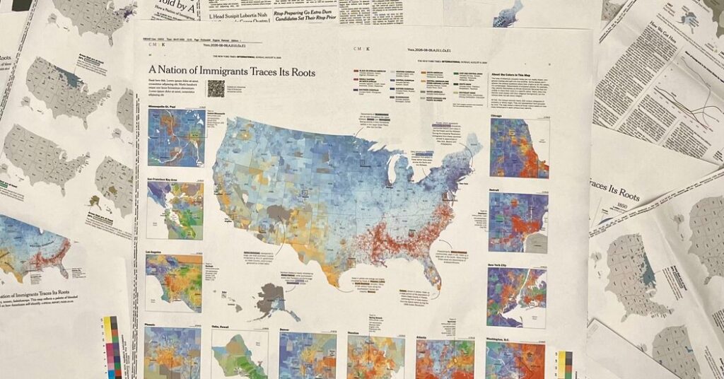
Many groups are represented in The Times’s map of American ancestry, which was published last month, just in time for the 250th anniversary of the Declaration of Independence. Using data from the U.S. Census Bureau’s American Community Survey from 2019 to 2024, the map depicts the country’s ethnic and cultural diversity and displays where different groups live today.
In an interview, Mr. Adelson, Mr. Buchanan and Albert Sun, a graphics editor, explained the origins of their map and the challenges presented by census data. This conversation has been edited.
Graphics journalists have published data maps of the United States before. Election results come to mind. When did you first think it was possible to publish a map of American ancestry?
LARRY BUCHANAN: Our plan was to do something on the history of U.S. immigration for the 250th anniversary of the country. We did not think of a map at first. We tried many different chart forms; initially we were taken by the idea of waves, as in waves of immigration. But it’s very hard to get specific data for different immigrant groups. The map gave us a way to represent all of them.
ALBERT SUN: We had seen a couple older versions of maps like this. They were not as recent or detailed, but they were very striking.
When we make a choropleth, a map with areas colored to show data, there’s a lot of attention to detail. We really wanted the map to look bright and colorful and be a reflection of the country in that way.
Once you figured out that a map was the best way to tell this story, what were the challenges with the census data that you were working with?
JEFF ADELSON: There were many. There are people who identify as simply American and don’t cite a specific ancestry. Large portions of the African American population don’t know their ancestry beyond when their ancestors were enslaved. Then you have the complicated ways that the census tries to deal with all these different ancestries. Larry, Albert and I had to reconcile a lot of the data so we could convey that information to readers.
What tools, be they advanced data techniques or old-school reporting, did you use to make that incomplete data presentable?
BUCHANAN: You talk to experts and interview people. You look at a map where you live and ask, Is this right? But we also relied on Jeff’s years of experience looking at census data.
ADELSON: We can build in checks to make sure that the data is showing what it’s supposed to show.
A lot of this work is understanding what is being tracked and what isn’t being tracked, and working within those limitations. Our goal was to work with immigration and demographic experts to build off prior work on various immigration data sets and understand where the potential pitfalls lay. As a very basic example, there’s the issue of people potentially being represented multiple times in the data because these aren’t exclusive categories. You can be Irish and German, or any combination of different categories.
BUCHANAN: Ultimately, on the map, the percentages don’t add to 100. And that’s part of the story. It’s easy to view these as initial problems and challenges to publication. But they’re problems and challenges for a reason: The country is mixed up — full of many different kinds of people. That’s what is interesting and what we’re trying to show.
Now that your work on this project is done, how do you use the map as a reader?
SUN: If a group of people is in the news, I might go check out where they’re distributed around the country. That was really fun during the World Cup, to see where the different diaspora communities are.
BUCHANAN: I have found great joy in these extraordinarily specific stories. Greek sponge divers in Tarpon Springs, Fla. — there’s a Greek island, Kalymnos, with the same sponges as the ones off the Gulf Coast of Florida. Springdale, Ark., has the largest population of Marshallese people outside of the Marshall Islands. The Portuguese in New Bedford, Mass., who came for whaling. The story of how one group worked its roots into the country — the fact that you can still see that on the map today is amazing to me.
The post How We Created an Intricate Tapestry of Americans’ Roots appeared first on New York Times.