Donald Trump staged an impromptu press conference to flaunt a stack of glossy charts, which he claims show the U.S. economy is doing far better than the administration’s official figures suggest.
The president, who fired the commissioner of the Bureau of Labor Statistics for reporting what he alleged without evidence of being “rigged” underwhelming job numbers, dragged reporters into the Oval Office Thursday for a surprise show-and-tell, suggesting everything’s better now than under former President Joe Biden’s watch.
Trump was joined by Stephen Moore, a senior visiting fellow in economics at the Heritage Foundation, the conservative think tank behind Project 2025.
Moore frequently praised the president in the presentation as they flipped through multiple easy-to-understand charts displaying the positive figures.
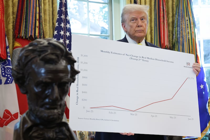
One chart, which Trump was particularly proud of, showed that the average household income in the U.S. had risen $1,174 during his second term compared to the Biden administration.
“This one chart really says it better than anything, this chart is pretty amazing,” Trump said before holding up the large line graph to reporters. “All new numbers.”
“That’s an incredible number,” Trump added. “If I would have said this, nobody would have believed it.”
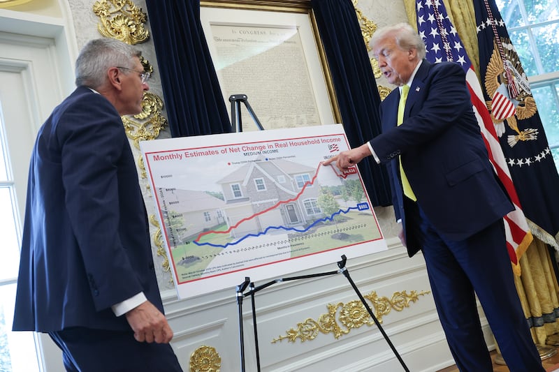
Another chart on show at the Oval Office suggested something called the “medium income” of real households had increased to $6,434, rather than the correct terminology of median income.
Neither Trump nor Moore, who was found in contempt of court in 2013 for stiffing his ex-wife Allison on more than $300,000 of alimony, child support divorce settlement payments, noticed the spelling mistake on the graph.
The charts, displayed in the White House by the author of Trumpnomics, come as independent forecasts paint a bleaker picture of the state of the U.S. economy.
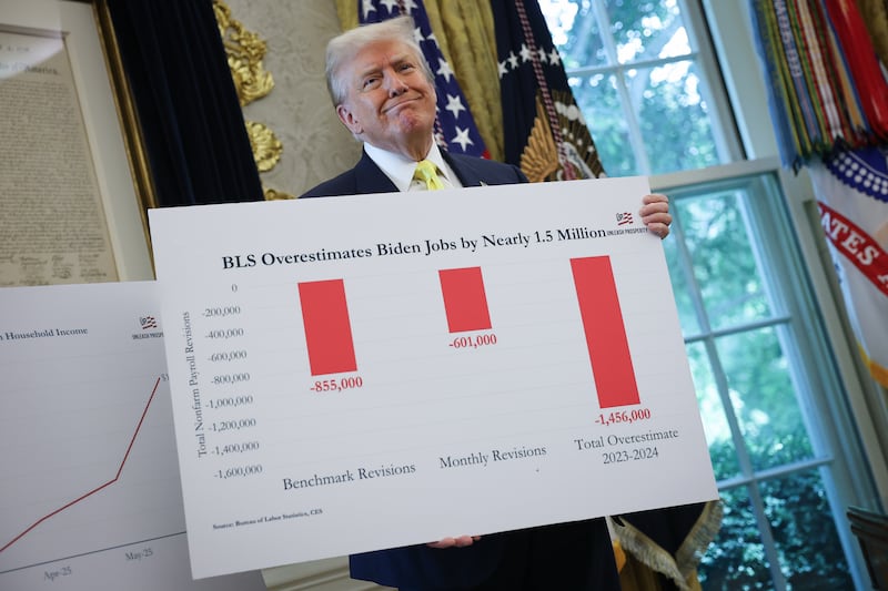
While Wall Street has been solid and even absorbing most of the fallout from Trump’s tariff plans, the Bureau of Labor Statistics reported that only 73,000 jobs were added in July, falling below expectations, and that May and June totals have been revised down by 258,000.
The Budget Lab at Yale also estimated on August 1 that Trump’s “reciprocal” tariff plan would cost households an average of $2,400 a year. Elsewhere, Goldman Sachs has predicted that the upcoming July inflation report will show a 3 percent increase in consumer prices over the past 12 months, up from 2.3 percent in April, as reported by the Associated Press.
To please Trump, who tries to avoid reading where he can, Moore began crunching some numbers and putting them on colorful graphs and line charts, which he knew the president would enjoy.
“I showed him about five or six of these charts, and he was excited about the good news,” Moore told The New York Times “So he said let’s have an impromptu press conference.”
Moore added that the numbers originate from unpublished data from the Census Bureau, making them extremely difficult to independently verify.
Moore also backed Trump’s firing of BLS commissioner Erika McEntarfer, while Trump doubled down on claims the agency reported negative jobs report for political reasons. “I think they did it purposely,” he said.
The White House did not immediately respond to a request for comment from the Daily Beast.
The post Trump Self-Soothes With Bonkers Big Chart Presentation Bashing Biden appeared first on The Daily Beast.