Target takes its colors very seriously.
The retailer’s iconic red, also known as Pantone 186, is a vibrant, highly saturated shade that makes its bullseye logo stand out in a crowd. It’s a color that catches the eye on subway platforms and suburban shopping centers alike.
A new employee-only line of apparel, designed in collaboration with Isaac Mizrahi, is dubbed Collection 186. And two decades ago, Target bought all the ad space in an issue of The New Yorker and asked the magazine’s illustrators to work only in black, white, and red.
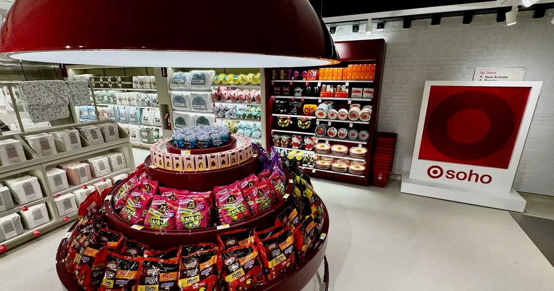
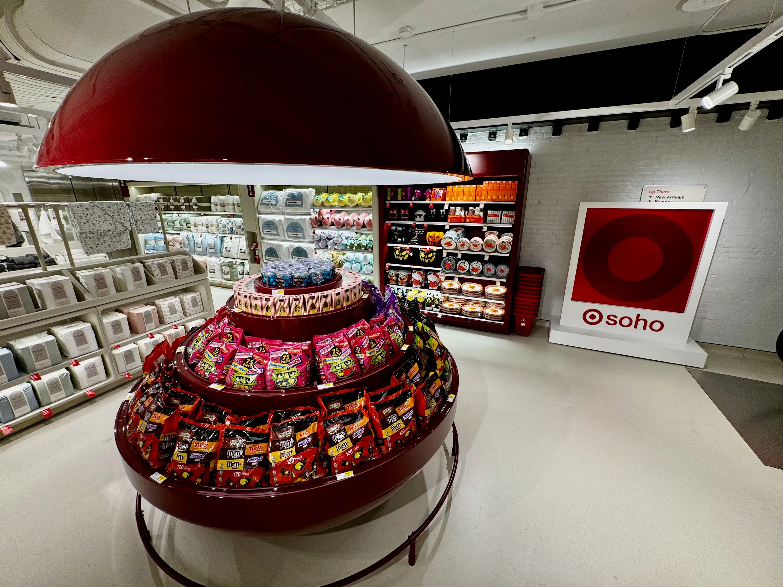
But when Target remodeled its SoHo location in New York last year, using the trademark red for nearly every element of the store’s entrance proved to be a bit much.
“It was just a little too overpowering, so our design team brought in this color that we’re now calling Cherry Stain to kind of help balance out all of the red,” Target’s chief brand officer Michelle Mesenburg told Business Insider during an exclusive store tour last week. “It has now become part of our IP color palette at Target.”
While the new Cherry Stain color appears on several fixtures in the SoHo store, it is more prominently seen as the official shade of the newly launched Beauty Studio department, which the retailer is rolling out in stores this year.
It’s a calmer, more inviting hue that both complements the primary red and serves as an alternative when the bullseye shade might come off a bit too hot.
The company is now using the shade in more contexts, including some Target logos that now appear as a combination of the Pantone 186 and the new Cherry Stain, rather than the traditional red and white.
“It’s a fresh chapter,” Mesenburg said. “We’re pulling elements of what we’re learning here [in SoHo]. It may not translate exactly one-for-one, but the influence is coming into the full chain.”
Read the original article on Business Insider
The post Target has added another red to its palette appeared first on Business Insider.