
When I was expecting my first baby, I spent untold hours trying to decorate her nursery.
Every time I sat down at the computer to pick out furniture and decor, I’d start strong: I’d find a crib I liked, then try to match it to a wallpaper that seemed to have the same “vibe.” It would always spiral from there.
Maybe I couldn’t find a bookshelf that exactly matched the crib, so I’d scroll through hundreds of shelves searching for one that popped out. Usually, none did. So I’d consider floating shelves instead. Not knowing which wood finish to pick, I’d switch gears and look at lamps. But what kind of lamp would be best? It went on and on.
I always ended up frustrated and exhausted, with no progress. “Come on,” I’d pump myself up in the mirror. “This should be fun and easy.”
But I knew the problem: I simply didn’t have an eye for design.
Other people could look at a room and see what it could be. I’d look at a room and see: a room. I had no idea what would be best where or with what, and no clue what “texture” was needed to “pull it together.”
Even as a kid, I never cared to do anything special to my room. Later, my dorms and early-adult apartments were a hodgepodge of inexpensive or hand-me-down furniture and decor. I didn’t care. But when I was pregnant, something changed. I had a maternal urge to “nest” and make my daughter’s room feel special, warm, and welcoming.
I remembered a friend showing me her daughter’s bedroom. With soft lighting, furniture that made you want to stay a while, and adorable decor, the space clearly said: “Welcome, little one. You are loved.”
Later, as I sat in front of my computer, beach-ball pregnant, clicking back and forth between open tabs, I was worried. So far, all my baby’s bedroom said was: “Come in! There’s no rug, and your books are in a pile in the corner!”
I got the inspiration I needed while working on an assignment
Around that time, I was writing for a real estate news site, mostly covering market trends, reality TV shows, and home fixes. But every so often, I was tasked with a design story. I depended on expert quotes and large pictures to distract readers from the fact that I was lacking in this real-life skill.
Then one day, an editor assigned me a story about paint color, specifically one of those “colors of the year” chosen by paint companies.
I always thought these were a little hacky: just a creative way to sell underperforming hues. But when I interviewed a woman on a color selection team, I was fascinated with the process.
She told me that before making a choice, they look at trending colors across all kinds of markets: makeup, clothing, and even cars. They also consider cultural trends and philosophies. The teams ask: Do people want brighter spaces? Moody rooms? How are people using their homes? “Colors of the year” weren’t just random paint picks. They were careful selections made after months of analysis.
I was intrigued, and when my husband and I moved into a townhome, it was my chance at a do-over on my now 1-year-old’s room (and the baby on the way). Maybe anchoring my design in a thoughtfully chosen color could help.
When I started with a color, it changed everything
I looked at all the color picks for that year and landed on Benjamin-Moore’s pick, a soft sage green called “October Mist.” It reminded me of a mossy lake or cool, misty mornings when I was a kid at sleepaway camp.
I thought about the color for a while, and eventually bought four-foot pine tree sticker decals online to put on the walls. Then, I came across a bed with sides that reminded me of a white picket fence. Together, I saw a sort of outdoor, backyard theme. I added a green shag rug and little throw pillows that looked like logs. It was original and fun.
When I showed my daughter the finished product, she loved it. I did too.
Starting with just a few color options was just what I needed. After that, everything seemed to make sense.
This year, I moved again. Unable to successfully peel and transfer the tree stickers, my new kids’ room is a blank slate. But I’m trying to create a room they’ll be proud of. To get started, I looked up the latest round of ‘color of the year’ selections. Glidden’s “Artifact,” a soft aqua color, reminded me of a blueish photo album my mom put together when I was a kid, which she filled with pictures of my since-gone grandparents and former homes I almost remember. I loved it.

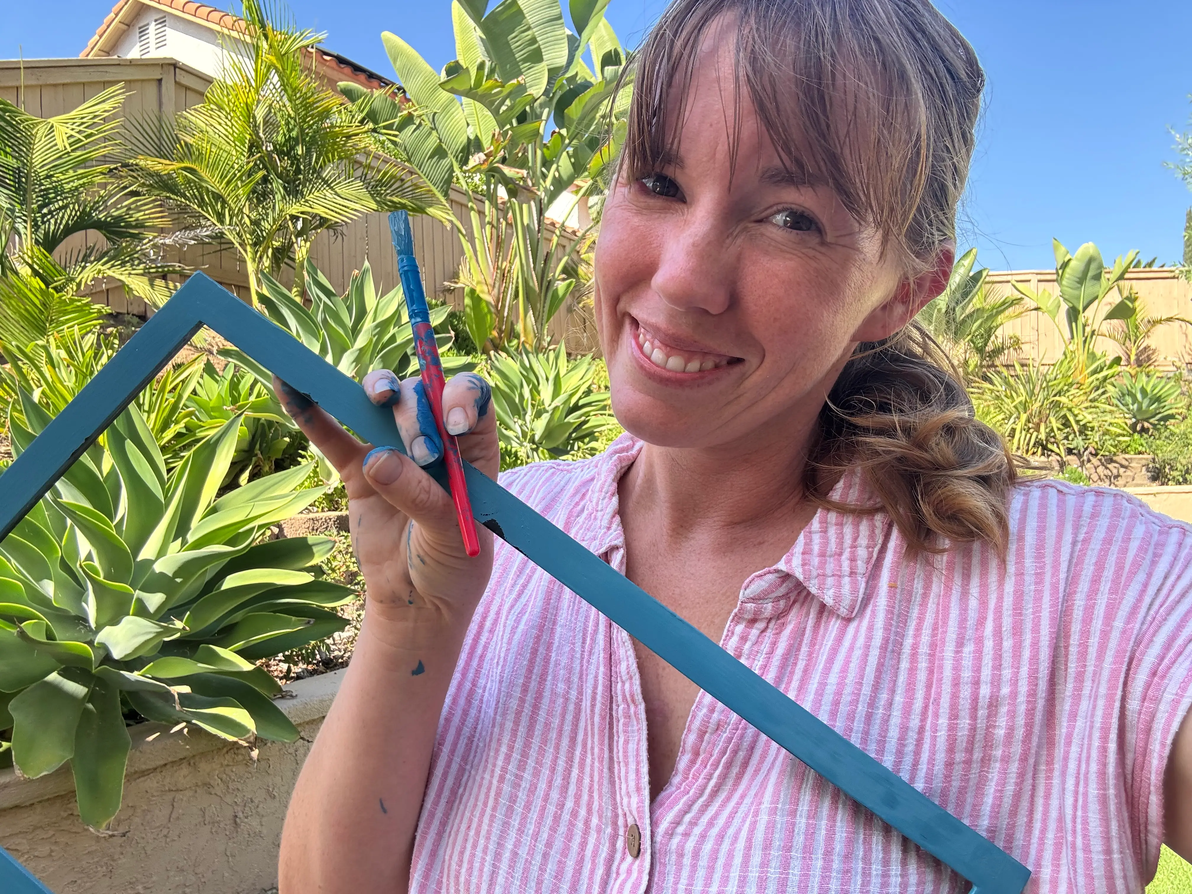
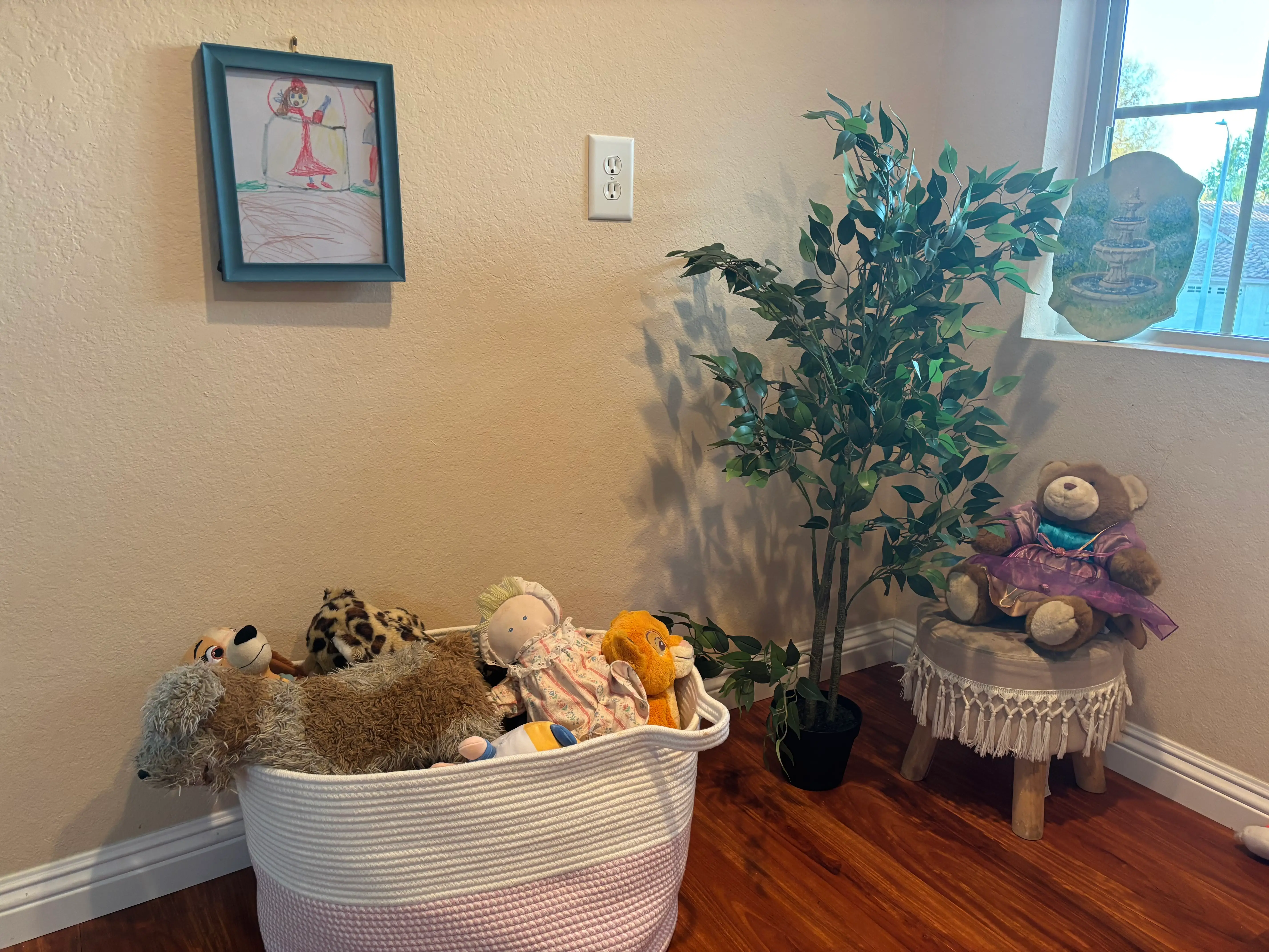
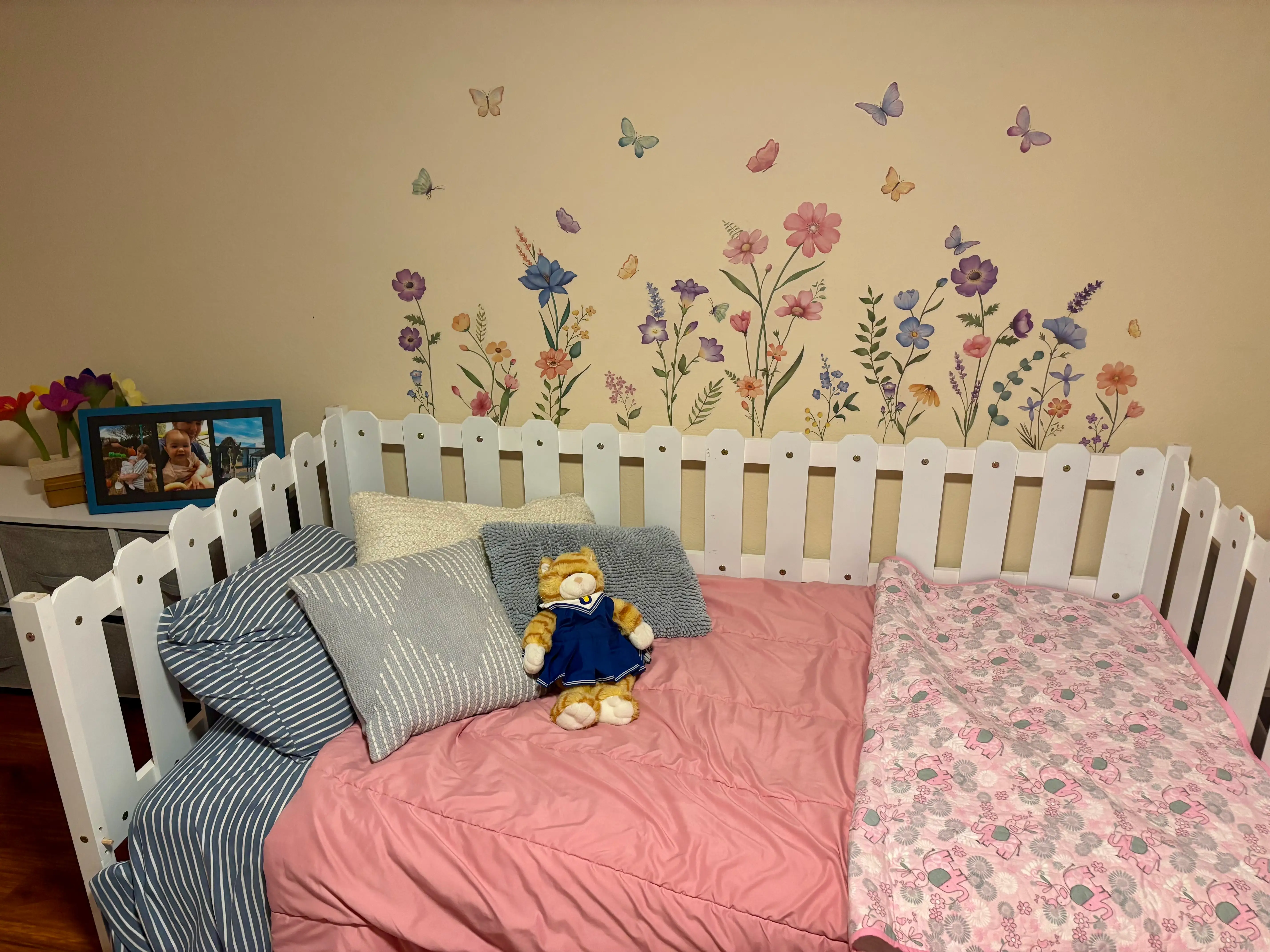
So the kids and I spent an afternoon using the color to paint old picture frames. It’s a small detail in the room, but I like how the blue pops against the peach walls, bringing attention to the memories. I then got some flower decals with pops of blue that match and put them above my oldest’s bed.
I’ll admit, the room is still a work in progress, and I’m probably spending more hours thinking about what the space needs than I should. But I’m making progress. So far, I’m proud to say: it looks good.
Read the original article on Business Insider
The post I thought I was hopeless at interior design. Picking a paint color for my daughter’s room gave me the creative spark I needed. appeared first on Business Insider.