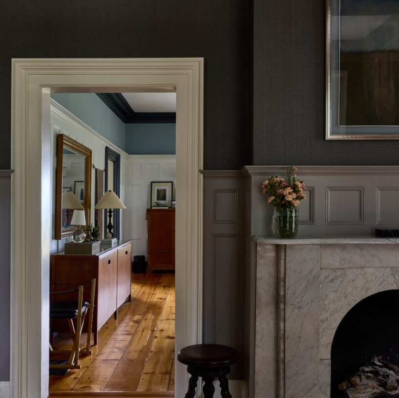
Sex, religion, politics … dark colors in decorating? Yes, that, too, can be a sensitive subject — even polarizing.
“Everyone is afraid of the dark,” says Leon Berry of Leon Berry Interiors. Most of his clients, he adds, “have a negative, almost emotional reaction when I talk about dark colors.” So he has learned to approach the subject delicately.
If his clients say they dislike dark colors in decor, Berry might mention eyeliner and how it helps highlight facial features, just as dark accents sharpen spaces.
Occasionally, he will ask those homeowners to describe their go-to purses or shoes, which are often black. “It’s like when you get dressed and black shoes match your outfit,” he tells them. “Black goes with everything.”
Berry also shares photographs of interiors, asking for clients’ opinions. If they indicate approval, he’ll gently point out dark features, such as wrought iron banisters, as proof that darkness can whisper, not just scream.
Fear of the dark is written into our DNA. Since potential threats aren’t readily apparent in the dark, shadowy spaces can feel ominous. They can take us back to primeval times when saber-toothed tigers and other predators lurked in the night.
But predators aside, dark spaces can also provide a sense of safety. “When you’re in a dark space, you don’t see where it ends,” says Lori Weitzner, founder of Lori Weitzner Design and author of “Ode to Color.” “The possibilities feel endless. … You feel like you’re in a cocoon and under the radar.”
Anjan Chatterjee, a neurology professor at the Perelman School of Medicine at the University of Pennsylvania and the author of “The Aesthetic Brain: How We Evolved to Desire Beauty and Enjoy Art,” has identified “homeyness” as one of three dimensions affecting the subjective experience of environments (the others are complexity and coherence, or legibility). “I suspect homeyness could apply when you think about dark studies or bars, especially if they’re paired with warm light like a fireplace,” he says.
Illumination helps declaw the dark, striking a balance between the known and unknown or the safe and dangerous. Instead of a campfire, amber or warm lightbulbs (which have a Kelvin rating of 2,000 to 3,000) can do the trick, Weitzner says. Cool white or daylight bulbs, with a Kelvin rating of 4,000 or higher, can make dark spaces feel confining, she adds.
To avoid a dungeon-like effect, consider other dark hues. Interior designer Chloe Legras of Boxwood Avenue gravitates toward dark burgundy (Sherwin-Williams Sommelier), black-green (Sherwin-Williams Andiron) or deep blue (Portola Paints In the Navy). Leatrice Eiseman, executive director of the Pantone Color Institute and director of the Eiseman Center for Color Information and Training, suggests teal green or midnight sky.
Since ancient times, deep blue (as well as purple) has been associated with luxury, elegance and high status. Ultramarine pigment was rarefied and costly, as it was derived from lapis lazuli, a stone transported to Europe from mines in present-day Afghanistan beginning in the medieval period. The Old Testament describes the deep purple of sacred garments, made with pigment sourced from sea snail secretions.
Eiseman is an advocate of deep purple. She painted the entrance hallway in a former home plum violet and hung framed mirrors to make the space feel more open. Like a magic trick, the move instantly elevated her home. “When I’d walk down the hallway, I got the impression it was never-ending. … It was a nice dramatic effect,” she says.
Dark colors can also create compelling optical illusions. When walls are dark, they appear to recede, making spaces look larger, says Berry, who chose a color he described as “a mink dark brown, almost black” for his home office.
But wall color isn’t the only effective way to wield darks. Berry painted the wooden ceiling beams in his living room black, which helps them blend into the space. “You would normally think they would stand out more,” he says, “but they are just a little accent. … If they were white, they would have been these white hanging things in my beautiful tonal living room. It wouldn’t have made sense.”
To clients who wanted to de-emphasize the black window trim in their newly constructed building, Berry suggested black accents throughout their apartment.
In a lighter room, though, the opposite is true: Dark elements will pop. To bring attention to features you want to highlight, use dark accents, Eiseman says, such as painting window frames a deep, rich color so they function almost as art pieces.
An espresso-stained wood floor or a navy accent wall can balance and anchor light spaces. “If it’s all white all the time, you don’t appreciate the color, and it looks like a hospital,” says Berry, who suggests adding bronze hardware or a dark backsplash to a white kitchen.
For hesitant clients, he often suggests painting a small section of wall and seeing how they respond to the color. Usually they come around. Even Berry’s husband, Richard, who wasn’t so sure about a charcoal gray color for their bedroom ceiling, was soon convinced: “Now he loves the room.”
The post The surprising case for using dark colors in your home appeared first on Washington Post.