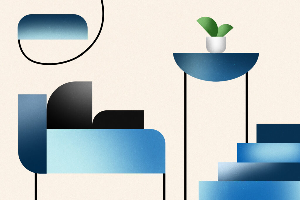
Math might seem far removed from interior design, but geometry is often the secret behind homes that sing. Decorators rely on formulas for determining the right size coffee table to pair with a couch and how many inches above a mantel to hang a painting. But they also turn to forms and formulas to achieve that certain je-ne-sais-quoi — those intangible qualities that differentiate the so-so from the scintillating.
“Honestly, as a creative person, mathematics has been my least favorite subject,” Frida Ramstedt, the Sweden-based author of “The Furniture Handbook” and “The Interior Design Handbook,” said in an email. “But in a business where everything is all about gut feeling, these proportions and formulas have been a great help.”
Washington, D.C.-based interior designer Christopher Boutlier agreed. “I don’t sit down and ‘do math’ in a literal way,” he said in an email. “But proportion and geometry guide almost every decision I make. Good interiors borrow from the same ideas that make classical architecture work: harmony, rhythm and proportion.” He explained that when something is even a few inches off, you can feel it. “The room becomes restless. When it is right, the space feels quiet. That is the math doing its job.”
For design pros, these principles are often ingrained or instinctual. For the rest of us, they can be learned. Consider this your cheat sheet.
The Fibonacci sequence
In this series, each number is the sum of the previous two (as in 0, 1, 1, 2, 3, 5). Also known as the “golden ratio,” it can be expressed as 1.618 or 60/40. Associated with beauty since ancient times, these proportions comprise the blueprint behind natural forms such as nautilus shells, pinecones and sunflowers and architectural masterpieces like the Parthenon, the Great Pyramid, Notre-Dame Cathedral and the Taj Mahal.
Try applying them to your floor plan, furnishing 6o percent of a room and leaving the remaining 40 percent empty. You can also use it for a color scheme. For a client’s office, Ohio-based designer Autumn Pochiro chose medium-tone blue for 60 percent of the space and indigo for the remainder.
The 60/30/10 principle
This self-explanatory proportion can be applied to the amount of color, pattern or texture. For instance, in a color scheme, there can be a dominant hue (used in 60 percent of a space), a secondary hue (used in 30 percent of a space) and an accent hue (used in 10 percent of a space).
In a bathroom she designed for a client, California-based designer Christine Markatos Lowe created a linear pattern using Mosaic House tiles in three tones of blue. For a client’s bedroom, Boutlier went with a color scheme of 60 percent soft neutrals, 30 percent mid-tone woods and 10 percent darker accents.
Symmetry
Including elements that correspond to each other in a balanced way helps achieve a serene, predictable effect. One way to accomplish this is with mirror symmetry, such as a bed flanked by nightstands or a couch bookended by matching works of art. Another is radial symmetry, where elements radiate from a central point, as with chandeliers and round dining tables.
In plane symmetry, which is used in patterns for upholstery, tile, wallcoverings and art, motifs repeat (and sometimes transform) across surfaces in consistent ways. Patterns with symmetrical shapes from nature, like the Platonic solids, flower of life and fractals, bring even more orderliness.
The Platonic solids appear in the crystalline structures of minerals. They include five perfectly symmetrical three-dimensional shapes, such as cubes and tetrahedrons. For a bold, graphic statement, consider the Nordic Knots Garden Maze rug.
Present in honeycombs, snowflakes and flower petals, the flower of life pattern consists of evenly spaced overlapping circles, as in the Flower of Life rug line from Gordian Rugs.
In fractals, the same pattern repeats at different scales, as with tree branching, river systems and fern fronds. Richard Taylor, professor of physics, psychology and art at the University of Oregon, has conducted research proving these patterns have calming effects. For your home, get the look with York Wallcoverings Tree Silhouette wallpaper or Etoffe Liquen wallpaper.
Be careful not to overly rely on symmetry, though; if a space is completely orderly, it can feel stiff and formal. For visual interest, add some asymmetry or unexpected elements. One way to achieve this is with groupings in odd numbers, like five vases on a mantel, seven glass balls in a bowl or three paintings.
The rule of thirds
For a balanced layout, divide your space into a 3×3 grid, with a focal point in the center. Scanning left to right and top to bottom, the colors, textures and lines should flow throughout. In a living room with a vaulted ceiling, New Jersey-based Blanche Garcia of Conscious Home split the room into thirds: furniture in the bottom, a custom bookshelf wall in the middle and empty space on top. For a client’s living room, Boutlier divided the seating area into thirds (circulation, furniture and empty space).
Adding it up
The ideal equation for a space combines order with some disorder. A “balance of paired elements and singular accents” will provide “enough repetition to feel ordered and enough variation to feel human,” Boutlier said. When designing a room, start with a formula like the golden ratio or rule of thirds. Then add a touch of the unexpected, say by including an odd number of decorative objects.
The post The secret to home design that sings? Geometry. appeared first on Washington Post.