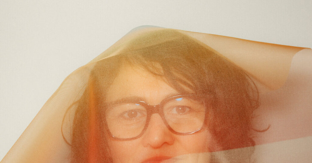
For much of her adult life, Margrethe Odgaard has been on a vision quest.
Over the years, the Danish designer and textile artist has created colors to enhance the wares of many well-known and prestigious brands, including Apple, IKEA and the high-end Danish furniture maker Montana, and has advised architects in the use of color in their buildings.
After studying textile making at the Royal Danish Academy and the Rhode Island School of Design, Odgaard traveled and worked all over the world and tried to define the distinctive colors preferred in various places, by different cultures. She started painting the colors she saw in a set of notebooks she calls her color diaries. One of the first entries featured the colors she saw under a sink on a visit to Japan. “There was a tube wrapped in mint green and one in a light rose, and there was a turquoise knob,” she said. “I marveled at it, thinking of this common industry that chose these as fitting colors.”
She then looked homeward, to speak of her own country’s particular palette, in her 2019 book, “Shades of Light,” which she has described as a “collection of colors that come into their own in the delicate intensity of Nordic light.”
Now working from a studio in Elsinore, about 30 miles north of Copenhagen, and teaching at her alma mater, the Academy, the 47-year-old designer has recently taken a new tack, using hand-dyed fabrics to create art pieces that have been exhibited in Scandinavia, India, the United States, and by the Paris-based gallerist who now represents her work, Maria Wettergren.
Her second solo exhibition with the French gallery will be featured at TEFAF Maastricht (March 14-19) and is inspired by another Dane: Ophelia, the fictional noblewoman who descends into madness and drowns at the end of Shakespeare’s play “Hamlet.” Using layers of tinted silk organza, she has combined swatches of fabric, some in muted, moody shades, others in brighter ones, all of them unusual.
The pieces also seem to pay homage to the Color Field artists of the 1950s and 1960s, with Wettergren referring to the most famous of those, Mark Rothko. But Odgaard’s layering of transparent silk adds shimmer and complexity to her pieces not available to painters — the overlays resulting in that waviness that physicists call a moiré pattern.
“Her methodology is almost that of a scientific,” Wettergren said in an email, “but her aspirations are poetical.”
In a video interview from her studio, Odgaard talked about color’s capacity to move us and her recent efforts to combine her sense of color and training in fabric making to produce singular fine art pieces. Her comments have been edited and condensed for clarity.
You’ve sometimes spoken of yourself as a color hunter rather than a color designer. Why?
I find myself in a constant search to establish a new connection with our senses, bodily senses, through color. I see color as the love child between light and material, and color as a very important language between our souls and our senses. Over the years, I’ve come to think of color as waves in the ocean. There are as many shades of color as there are waves. They are constantly shifting, reflecting the sunlight and giving shades. Color has been an obsession of mine, trying to hunt it, acknowledging that I will never be able to fix it, to sort of hold it between my hands.
What role have your color diaries played in your work?
In building up my understanding of color and in training myself, I decided at some point to start focusing on what I call cultural color identities. I have lived in Philadelphia, New York, Paris and worked in India for seven years, and obviously grew up in Denmark, so I’ve seen the world from different cultures and noticed in each of these cultures new color preference and new ways to combine colors. In my color diaries, I decided to try and focus on what makes different cultures have these different traditions.
You’ve said that your Danish culture is one of “slow and hesitant light.” Could you talk about your project to define a palette of the north?
After three years of studying color in three different continents [she was also in Japan and Morocco, as well as Iceland] I thought it was time to try and understand my own cultural-color identity, the palette of the north. I began my long study of what I call shades of light. It is a major factor in defining the Scandinavian palette to come to terms with our dim, slow light, the way the morning awakens in such a long, slow stretch.
What is the role of color in hygge, the Danish concept of coziness?
During my research on shades of light, the colors of the north, I came to realize how we can actually divide our color perceptions into two contrasts: light and dark — light summers and dark winters — and then warm and cold. The cold represents the universe, the dark blue sky that’s so present during our winters. And as a way of tackling the dark blue sky, we use hygge in terms of warmth, in terms of embers in fireplaces, warm sheepskins, warm tea, warm cacao, all that sort of heating up our bodies and our minds, represented by orange. If you learn about color in fine art, you will know that blue colors distance themselves in painting, and warm colors reach out and move close. We have distant and close represented by a blue universe and an orange ember.
You have spoken about your effort to see color with the “naked eye.” How do you try to teach your students to do this?
When I’m teaching, I make an effort to help my students understand how they can end up thinking colors instead of creating and sensing them. I have a specific exercise in which I ask them to paint a tomato by remembrance. In almost all cases, it’s not the same red. Very rarely is there a student who knows that tomato red is actually quite brown.
This year’s Pantone color of the year is a shade of white called Cloud Dancer. What do you think of color trends?
I think color trends have just been made up for the industry to earn money and sell new colors. I don’t really care about it. It’s not important. The only thing I can use color trends for is it tells me where we are in our culture.
You’ve said we should talk about colors as an experience of the senses. What does this mean?
To me, working with color is an indirect way to work with human beings and the well-being of human beings, and that’s not limited to trends or time. To me the biggest achievement is to create color that will last over time.
How do you think about emotion and color?
If you think of color as the result of light kissing the surface, you will also understand that color is light, light is energy, and we live from energy. So without light and quality light, we get depressed and we fade.
What made you decide to shift into producing fine art pieces from hand-colored fabrics?
Ever since I was a child, I wanted to become an artist, but I didn’t pursue the education. I pursued design because I wanted to have a living, and to be able to engage with human beings in everyday life. Now after 20 years as a designer, I am slowly moving to acknowledging this voice that I have.
The post A Danish Designer Explores Color for the Soul and the Senses appeared first on New York Times.