Mariyam Cementwala is a Foreign Service officer on leave from the State Department.
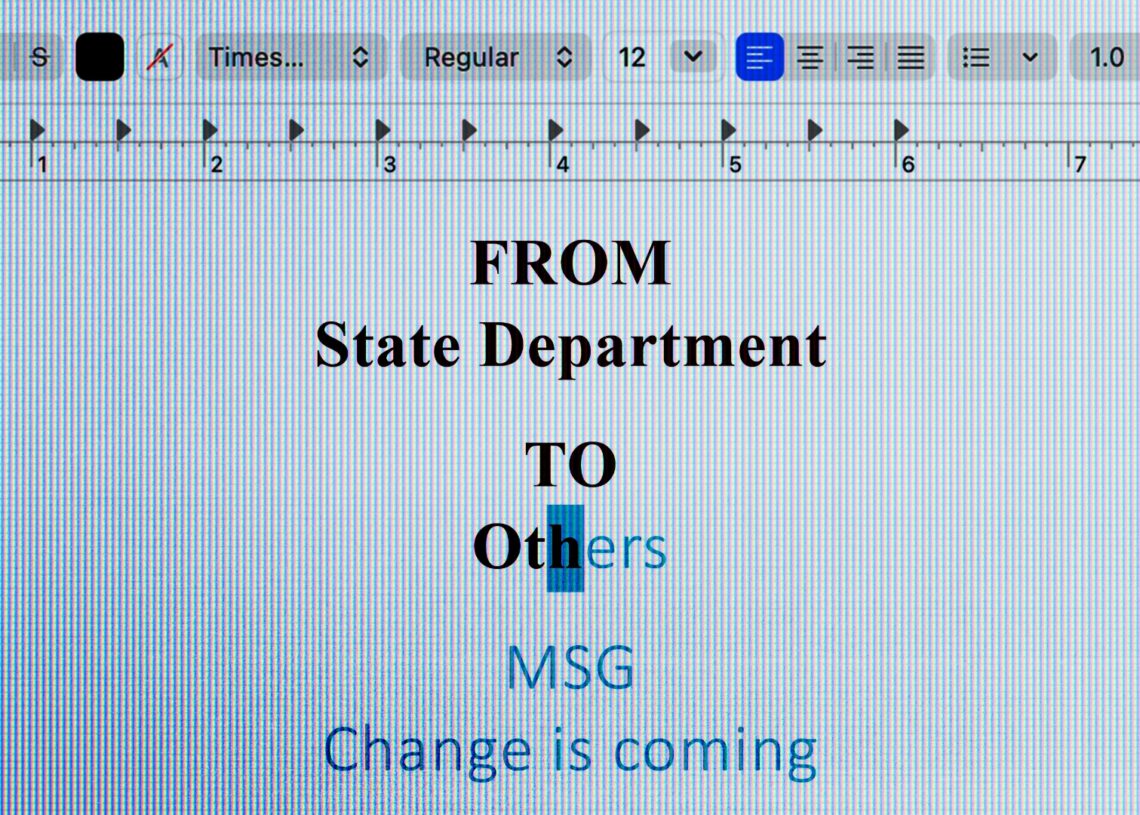
When the State Department recently reversed a Biden administration policy change to use the Calibri font instead of Times New Roman in diplomatic communications, Secretary of State Marco Rubio described the decision by his predecessor as a “wasteful” diversity move.
In my personal capacity, I believe this reversal is wrong. I should know, because I proposed the idea to change the font at the agency. For more than 14 years, I have represented the United States on several continents as a Foreign Service officer. I’m also blind.
In December 2022, I was a senior adviser to our chief diversity and inclusion officer. I was tasked with developing an easy but tangible win on accessibility issues for our office. Having disability experience, I wrote the memo Secretary of State Antony Blinken signed in January 2023 to move the department from Times New Roman to Calibri, a sans serif font.
This was a small cost-neutral shift to help employees and members of the public with disabilities more easily access departmental sites and information, such as our travel alerts and passport applications.
Sans serif fonts, with their straighter lines and simpler contours, are easier for optical character recognition technologies to detect and convert into audible speech. Nearly 9 million Americans have significant vision loss. These fonts can also help over 30 million Americans with dyslexia, as well as other learning disabilities, more easily read and comprehend printed text.
The State Department, however, justified reversing the font policy because Times New Roman is “more formal and professional.” “To restore decorum and professionalism to the Department’s written work products … the Department is returning to Times New Roman as its standard typeface,” a diplomatic cable outlined.
The initial font switch made a splash in the national media and with television pundits — to my disbelief. In 2023, I thought this was a minor adjustment to showcase accessibility — not a significant change that would better the lives of disabled diplomats or the public. But what I didn’t recognize is how crucial it is to raise basic awareness — lacking in our agency and many other places in society — about disability, accommodations and the right to equal access.
The font swap was certainly not enough to pat ourselves on the back. It was intended as the start of a larger conversation, but it catapulted that discussion on equal access and disability inclusion into the national dialogue, showing how small changes can improve access not just for people with disabilities but for the elderly, children, new English-language learners and many others.
In April, as members of the current administration trickled in, I discussed with a new appointee my experience navigating the often intransigent bureaucracy and making institutional change, still hopeful that disability inclusion remained a bipartisan issue. Amid other topics, I candidly answered questions about the font and the motivation to modify it, demonstrating how squiggly lines and curlicues obfuscate screen-reading technologies. Unfortunately, that’s as far as that chat went. For some months, I have been grappling with the painful realization of a much larger disregard of disability inclusion — magnified by this latest decision.
I’ve experienced, in Democratic and Republican administrations, barriers impacting Foreign Service officers with disabilities. Despite these obstacles, I continued serving the American people. However, what I wanted was to focus on foreign policy as a diplomat, not to be a disability rights activist debating fonts and other reasonable accommodations. But in that latter role — if we can get beyond the punditry and partisanship and start to look at each other’s humanity — I hope the conversation on equal access continues and inspires meaningful changes instead of petty font wars.
The post The State Department font change is about respect, not aesthetics appeared first on Washington Post.