Both an advertisement and a piece of art, the modern movie poster may be the industry’s most succinct illustration of the merger of commerce and creativity, encapsulating a film’s ambitions and themes in a single one-sheet. The Envelope spoke to the masterminds behind three of this year’s most arresting campaigns to learn the secrets of their craft.
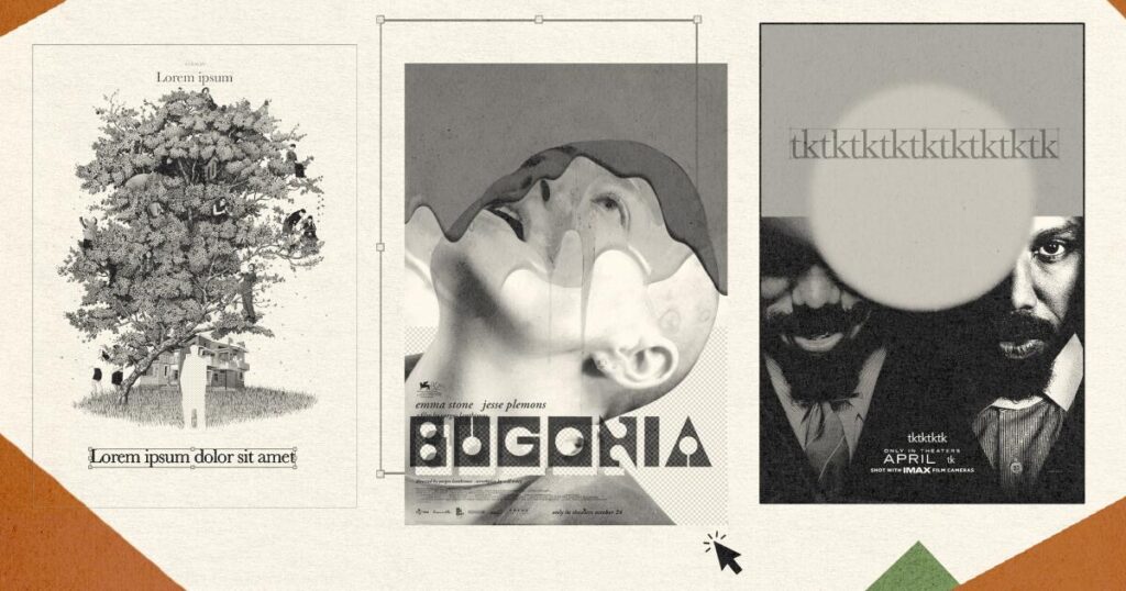
‘Bugonia’
Graphic designer Vasilis Marmatakis has collaborated on every Yorgos Lanthimos film since 2009’s “Dogtooth.” So when Marmatakis began work on the director’s most recent provocation, their well-established routine continued. “He never says anything,” Marmatakis admits, laughing. “He just lets me wander off in all these different directions.”
As usual, Marmatakis saw the “Bugonia” script early on, and once he started brainstorming poster concepts, he fixated on a photo of Emma Stone taken on set, her head shaved, her eyes looking skyward and her mouth open. “I thought it was interesting,” he explains. “You don’t know if she’s in awe, if she’s dying, if she’s getting tortured, if she’s in pain, if it is pleasure. There’s so many layers to this expression.”
The poster’s striking abstractness is akin to Marmatakis’ earlier one-sheets for Lanthimos, which obliquely hint at his movies’ thorny thematic elements without spelling out the plot. To that end, Marmatakis also incorporated blood and honey dripping down on Stone, suggesting this thriller’s disturbing violence while teasing the importance of bees to the story. But Marmatakis’ designs, often gorgeously abstract, are intended to entice viewers, not alienate them.
“I don’t underestimate the audience thinking that they will not get it,” he says. “I don’t think, ‘I’ll make something easy.’ I think people will get it — and if they don’t get it before the film, they might get it when they come out of the cinema.”
‘No Other Choice’
Lee Changzu’s strategy for Park Chan-wook’s dark comedy was simple. “I wanted [the poster] to feel beautiful,” recalls Lee, a key art designer at the South Korean studio Steady. “And, of course, a little bit strange, because that is what I think of when I think of Director Park’s work.”
Rather than basing the one-sheet around Lee Byung Hun’s scheming, murderous Man-su, she emphasized a blooming crape myrtle tree, a reference to the protagonist’s garden. “From the script stage, the idea of the image was that there were roots that were wrapped around the characters,” says Lee. “But when I saw the finished film, I realized that this imagery was too dark. So we went in a different direction and focused more on the surface, the trees that are growing above land.”
“No Other Choice” balances satire with political commentary, and that mix of tones emerges from Lee’s deceptively whimsical poster, in which many of the film’s supporting players reside in the branches, while Man-su stares poker-faced at the viewer on the ground. “I wanted to provoke the onlooker’s curiosity,” she says, “so I tried to distill a lot of black-comedy aspects. I wanted the image to feel ironic. While it is externally beautiful, it would be internally twisted.”
The actors posed for a photo shoot, while Lee hand-illustrated the tree and the house in ink. “We scan [the drawings], digitize it, and then we go through a coloring and editing process. Then we overlay that with the photos.” Through intermediaries, she got Park’s feedback on what he wanted changed — for instance, he insisted that the tree bark be smooth, a distinctive characteristic of crape myrtles.
“What Director Park really focuses on are the details, things that normal people might not notice,” explains Lee. “Whenever he made a suggestion, it improved the image.”
‘Sinners’
When a major studio promotes its latest blockbuster, it’s a no-brainer to highlight the popular intellectual property at the center. But unlike a Batman or Superman movie, Warner Bros.’ “Sinners” was an original idea. So the creative team instead relied on other selling points — namely, a hit filmmaker and a bankable star.
“Ryan Coogler is a big director — him teaming up with Michael B. [Jordan] for the fifth time is a big thing,” Susie Shen, executive vice president of creative advertising at Warner Bros. Discovery, says. “So we started there.”
Warner Bros. and its creative partners developed a string of moody, colorful posters that were remarkable for what they didn’t show about Coogler’s genre-bending story. The initial teaser poster, which displays half the faces of Jordan’s twin-brother characters Smoke and Stack, doesn’t suggest a period picture — or a vampire flick. Similarly, the principal “Sinners” one-sheet, created by the agency Gravillis Inc., avoided obvious signs of bloodsuckers.
Partly, the decision was based on preserving the film’s surprises. But Gravillis Inc. Chief Executive and Chief Creative Officer Kenny Gravillis says they also wanted to keep audiences from thinking, “‘Oh, this is just a vampire film.’ It’s way more than just a vampire film.” To hint at “Sinners’” sinister supernatural element, the designers did add tiny but menacing figures in the background. “You don’t want to make it too recognizable,” Gravillis explains. “You just want to know they’re back there.”
As for artfully implying this event picture’s deft blend of action and drama, the campaign chose a contemplative, mournful image of its star for the main poster. “It was trying to evoke more of the depth of the character, that [Jordan] wasn’t just this action-y guy,” says Gravillis. “There was another image we had where he was more badass. But this one was more subtle — it was the right move.”
The post The art of the movie poster: 3 of this year’s most striking one-sheets, explained appeared first on Los Angeles Times.